Brand
Atlantic Chamber of Commerce
Embracing the Gradient Between Business and the Human Element
Welcome to the new era of The Atlantic Chamber of Commerce, a business association that embraces innovation.
Four solid vibrant C’s come together into a captivating gradient that seamlessly blends. The smooth transition from one colour to another represents the dynamic nature of the organization, ever-evolving and adapting to change. This gradient not only adds a sense of movement but also symbolizes the diversity and variety of elements that come together to form a unified whole.
Logo
A logo should authentically reflect the core values, mission, and identity of a brand. When integrity is maintained in the design process, the logo becomes a visual embodiment of the brand’s commitment, creating a genuine and lasting connection with consumers.
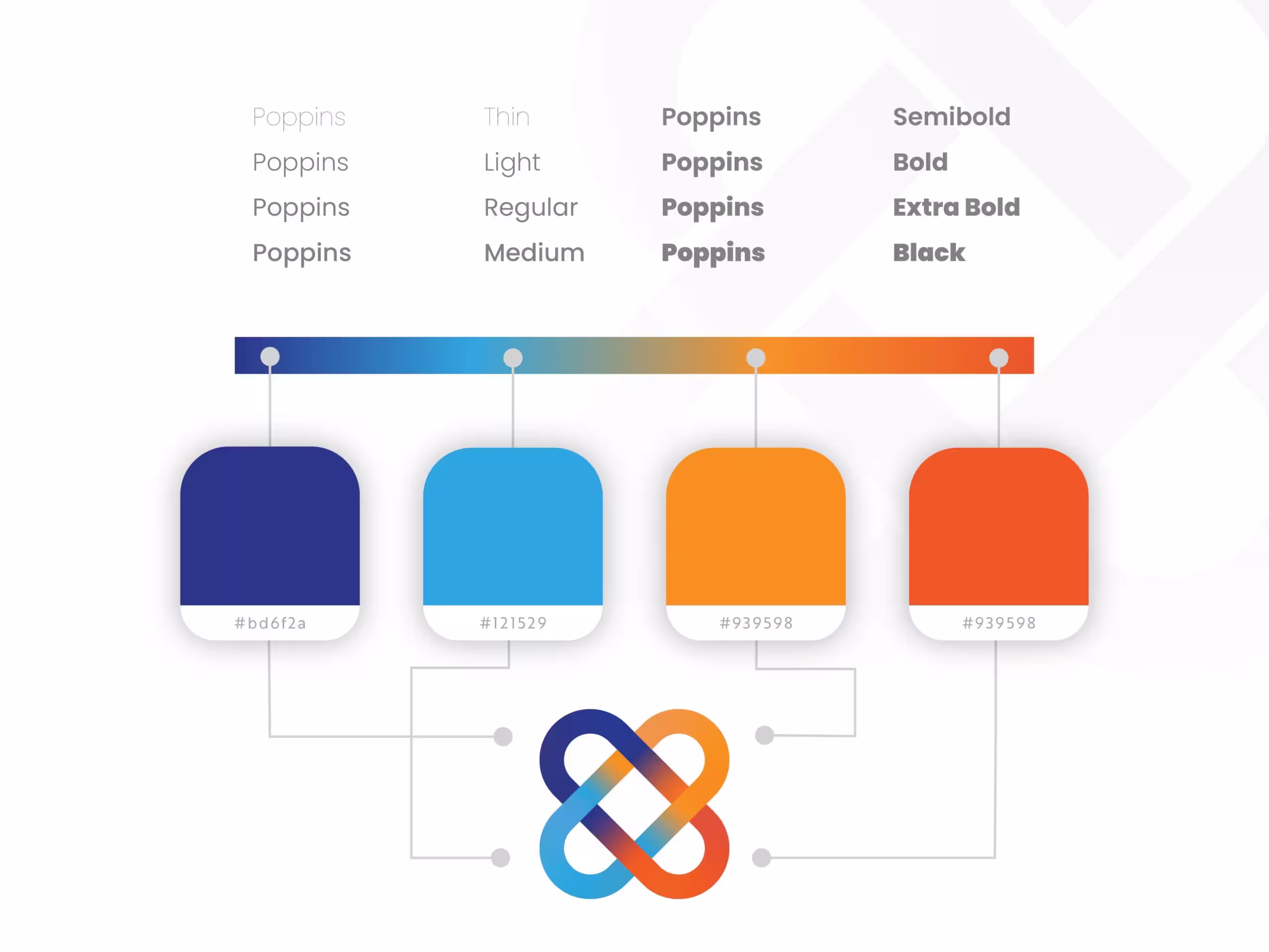
Colour
A primary colour palette serves as the cornerstone of a brand’s visual identity,
playing a fundamental role in establishing recognition and fostering a strong
brand association.
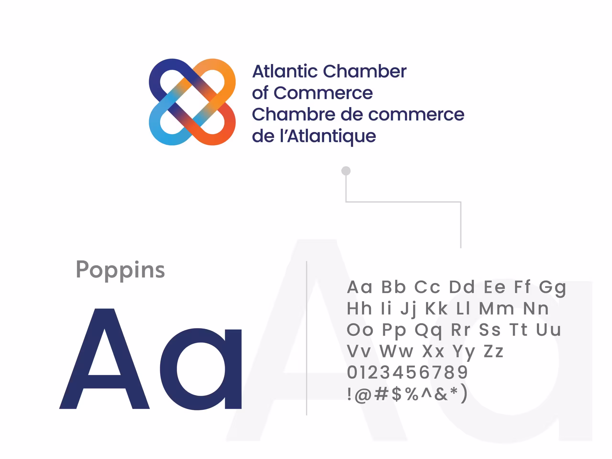
Typography
A sans serif font is often used for corporate and editorial design, as well as web interfaces. Poppins has a modern and friendly feel, with a hint of sophistication. Its character can be described as approachable, balanced, and versatile.

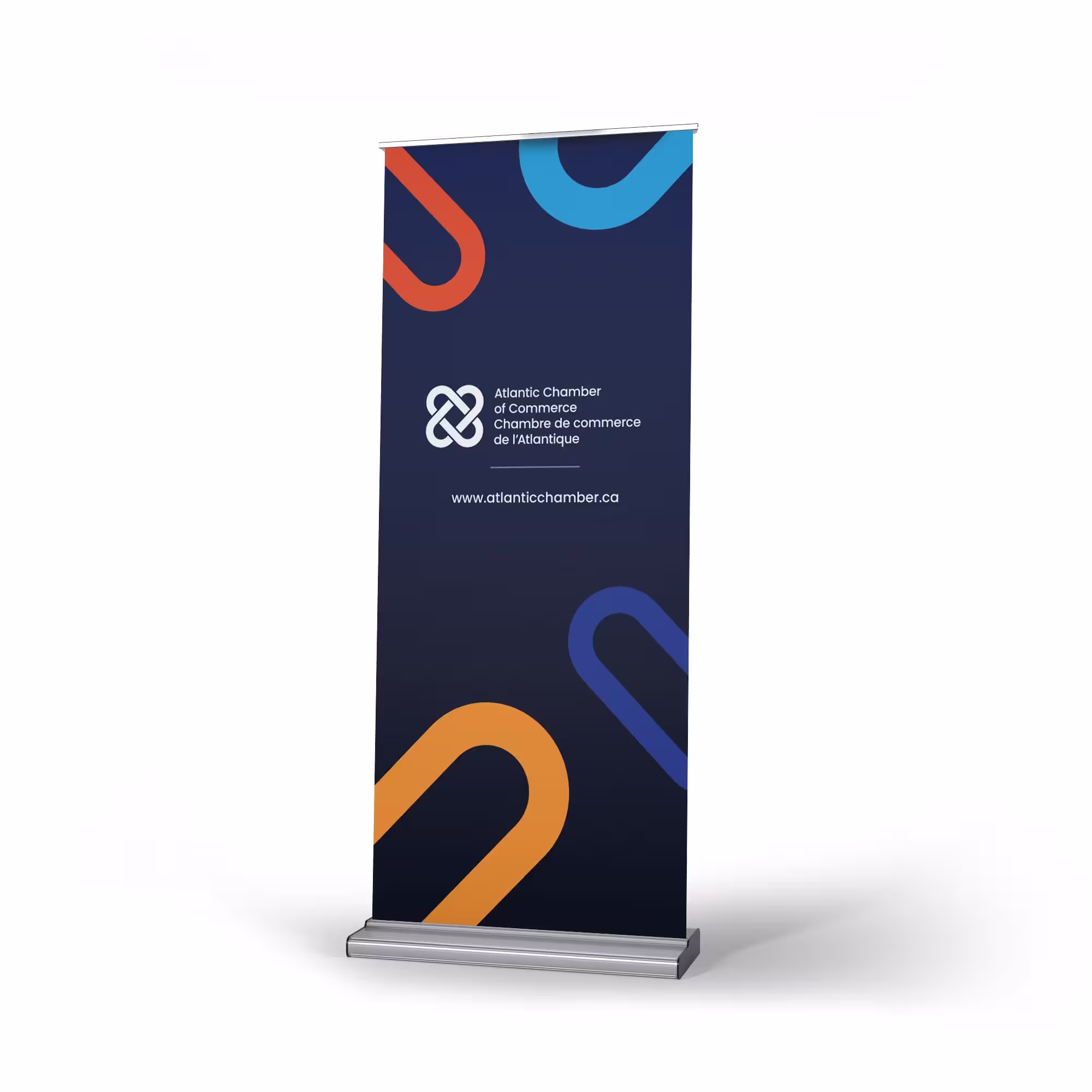
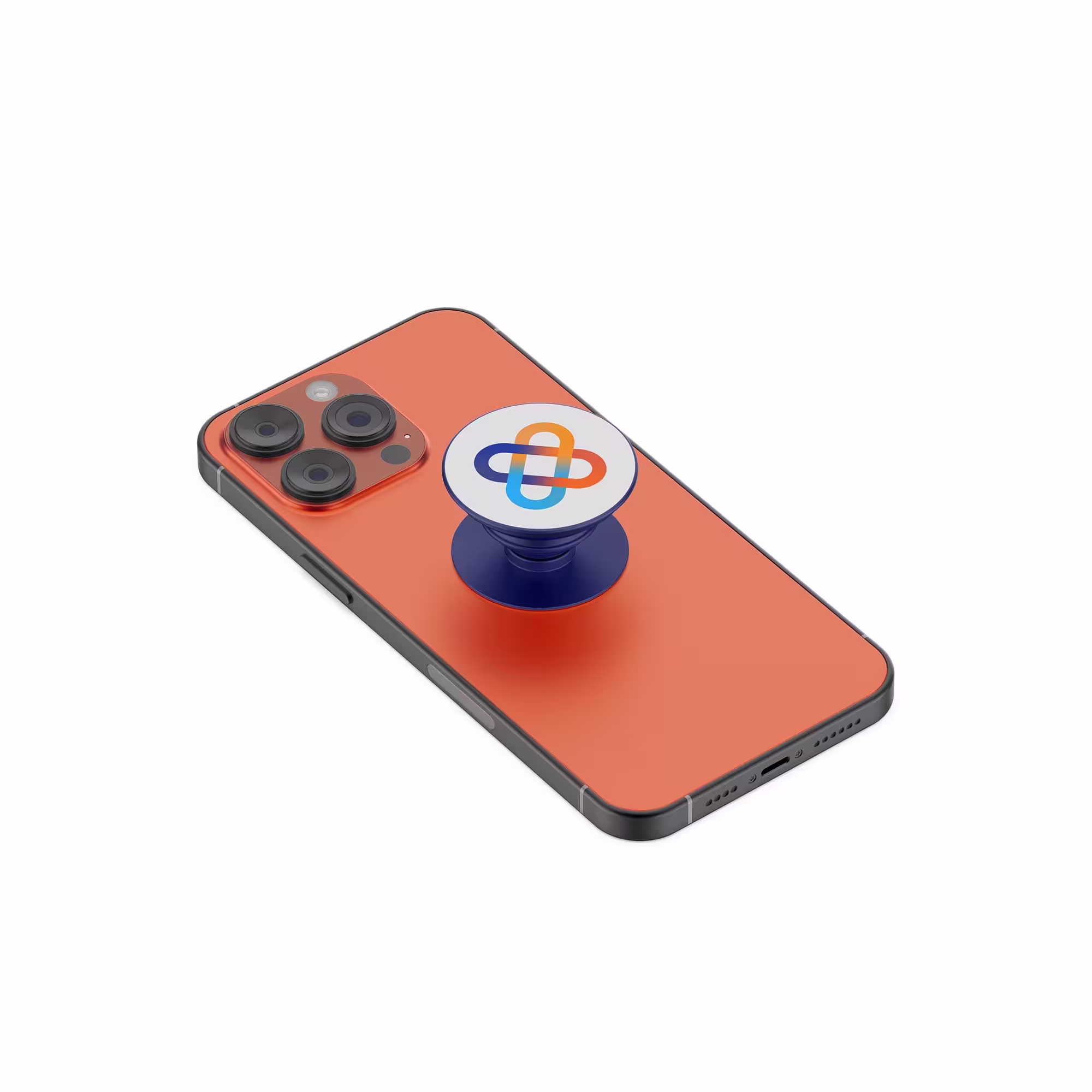
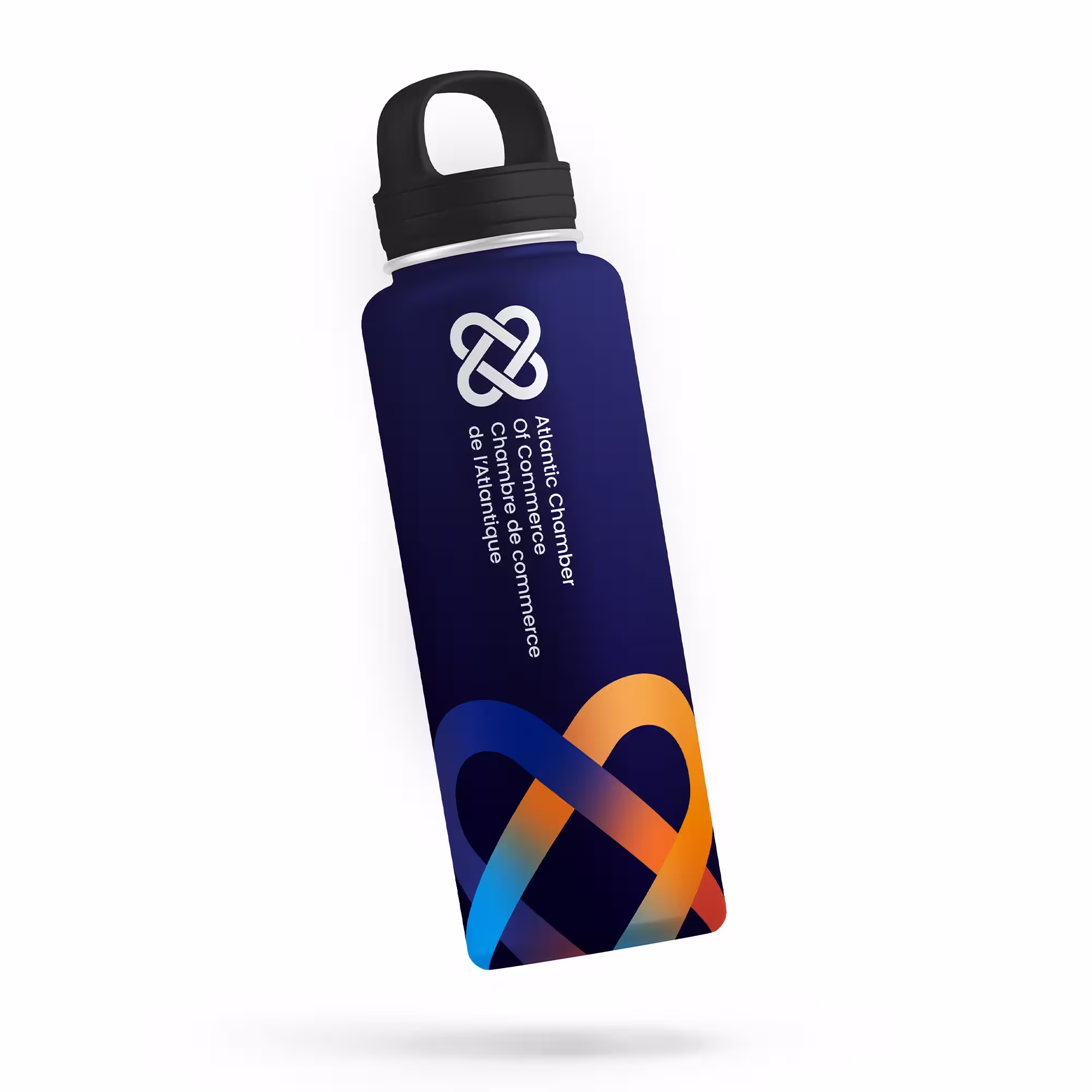
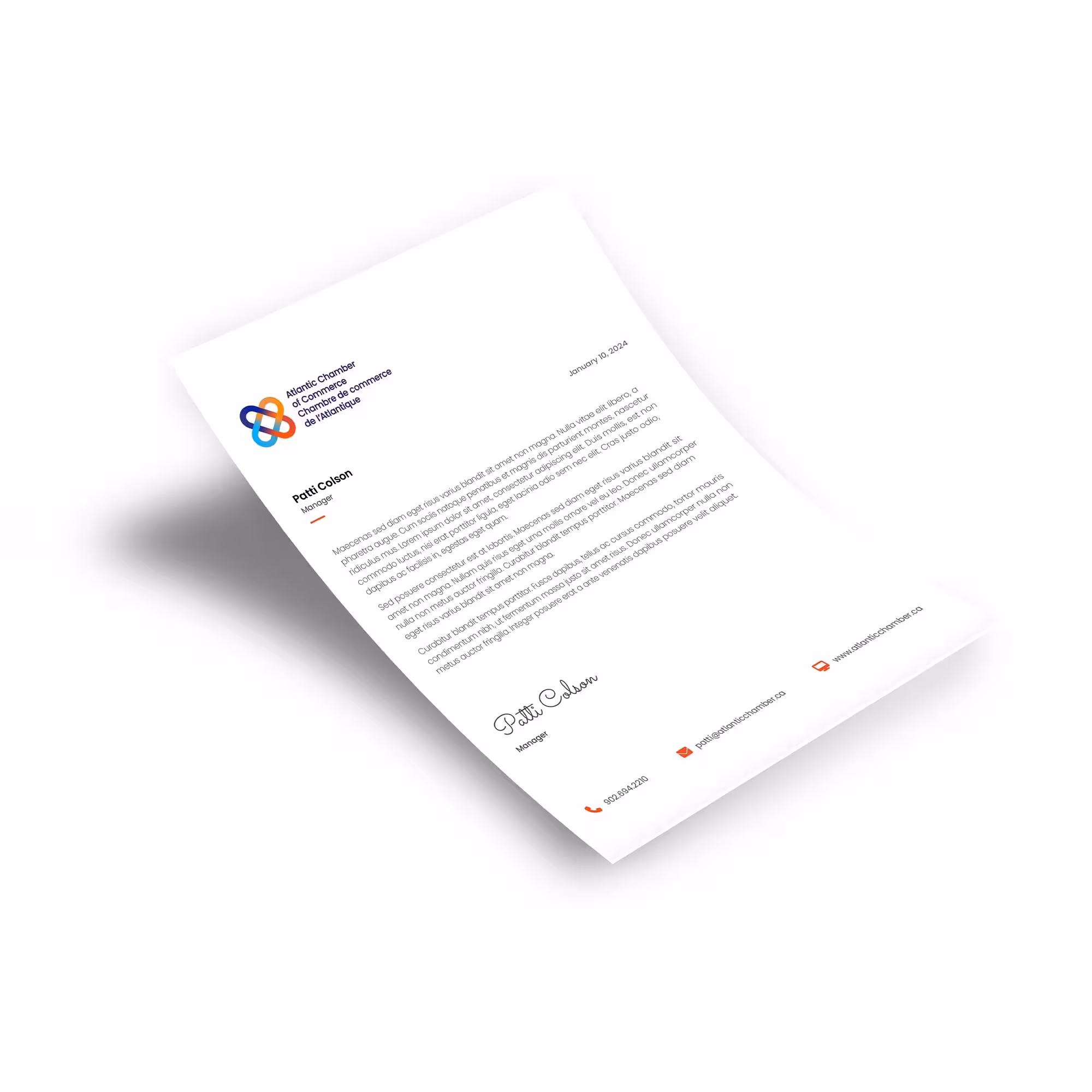
Mockups
A consistent and cohesive visual identity for a brand is extremely important. Maintaining visual impact as well as a consistent design enhances the overall professionalism and trustworthiness of your brand.
Branded elements play a crucial role in shaping a brand’s identity and fostering recognition. Consistent use of these elements across various touch points helps create a cohesive and memorable brand experience.
We’re dedicated to building smart strategic solutions.
Ready to see what we can do for you?