Brand + Website
KickAsh
The WaterWerks team worked with The Smokers Helpline in 2018 to create KickAsh, an online tool to help people quit smoking. Now, in 2025, it was time for a refresh and new direction so they could continue their positive impact on smokers and vapers looking to quit.
Helping people quit, their way
Originally built to help people quit smoking cigarettes, KickAsh needed to evolve alongside changing habits. With vaping becoming increasingly common among younger users, we expanded the tool’s scope and language to speak directly to those looking to quit smoking, vaping, or both.
The content refresh process involved a move in both messaging and design to reflect a more inclusive, empathetic approach, geared towards today’s youth. Our goal was to meet people where they are, without judgment, and offer support that felt real, relatable, and doable. That meant revisiting every touchpoint, from the homepage to logged in user dashboard prompts, to ensure people felt seen no matter what they were trying to leave behind.
Real Writing,
for Real People
One of the biggest shifts came in the tone of the copy. The digital vernacular has changed a lot since 2018. The voice is conversational and encouraging. We recognize that quitting is hard, and deeply personal, so the new copy speaks with empathy and focuses on small wins, helping users feel supported and understood every step of the way.
New Design,
Same Goals
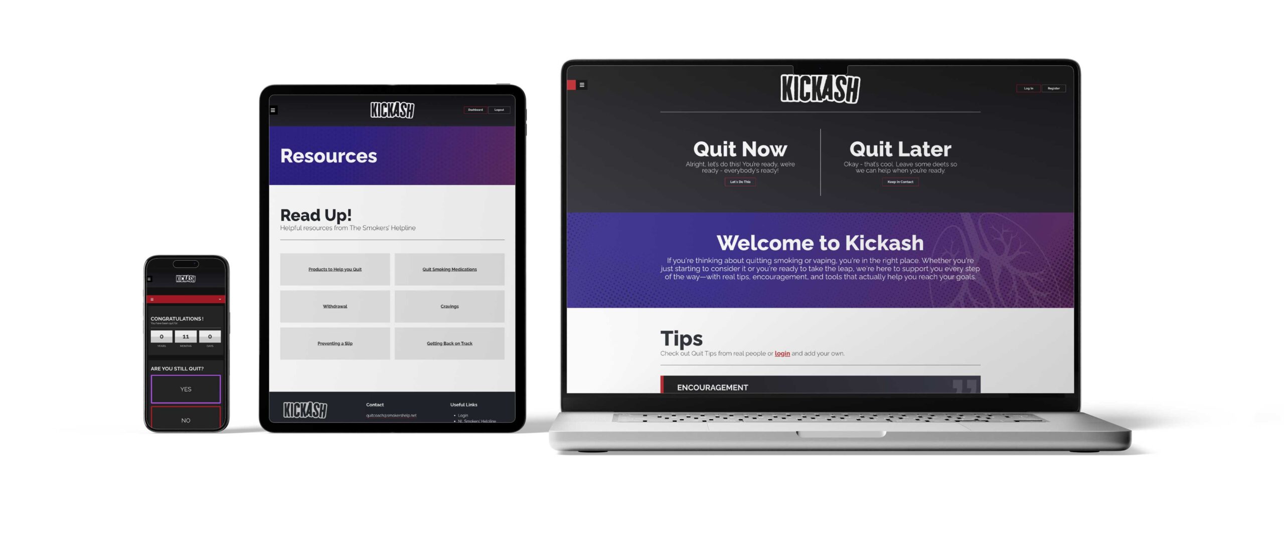
Along with the writing updates, we refreshed the look and feel of the site to better reflect the lives and preferences of a younger audience. The visuals are clean, modern, and inclusive, with just the right amount of personality. We avoided anything overly trendy so KickAsh could stay relevant and trustworthy over time.
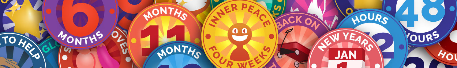
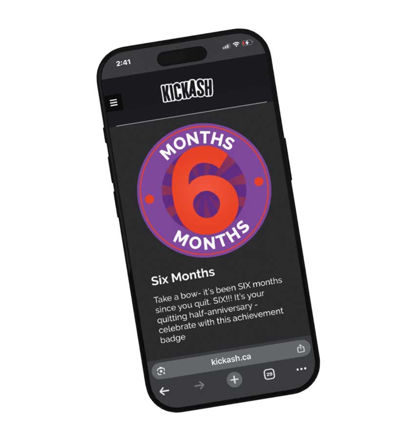
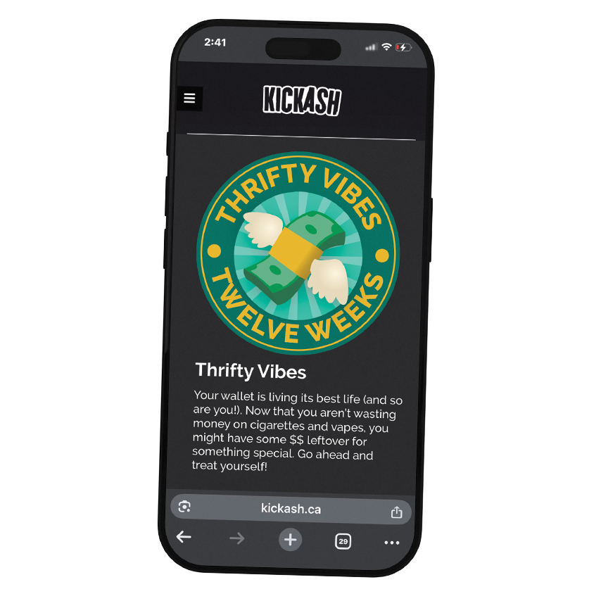
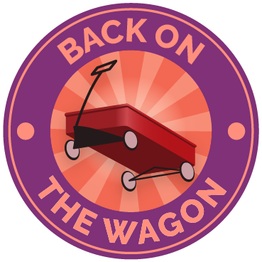
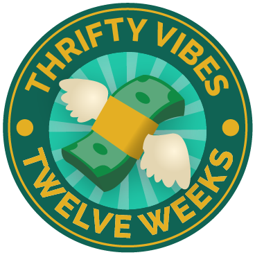
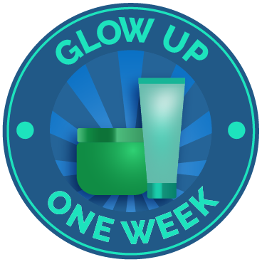
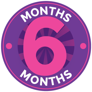
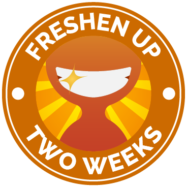
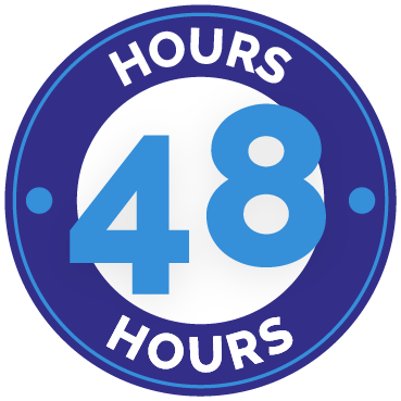
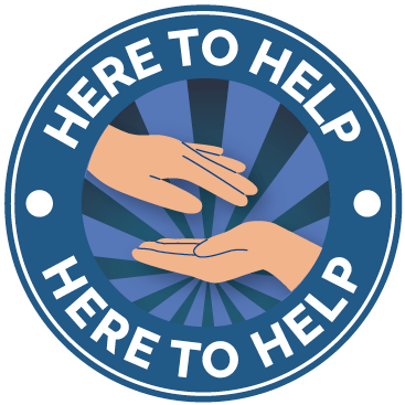
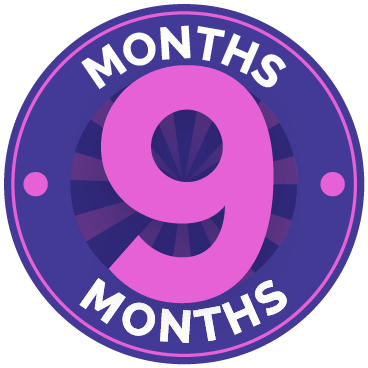
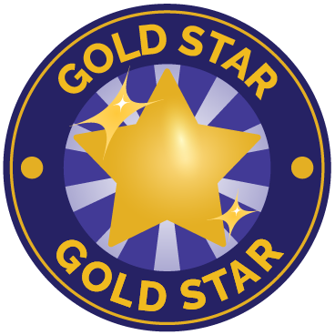
As part of the update for the KickAsh tool, we refreshed the visual badges users earn throughout their quitting journey. These badges do more than just mark milestones, they create moments of encouragement and pride in a way that’s playful, inclusive, and pressure-free. Just like the updated copy, the visual language is warm, positive, and non-judgmental, aimed at making people feel good about every step forward, no matter how big or small.
In the case of the Back on the Wagon badge, it’s encouraging and forgiving, just like the copy. It’s a wink of support, not a lecture.
Why this Visual Approach Matters
We treated each badge not just as a reward, but as a moment of recognition. The friendly tone and graphic style help de-stigmatize the process of quitting and create emotional momentum. This design style was created to meet users where they are, offering support through clean, empathetic visuals that feel good to earn; without pressure or perfectionism. Like KickAsh as a whole, the badges reinforce the message: progress is personal, and every step counts.
Design That Adapts to Any Format
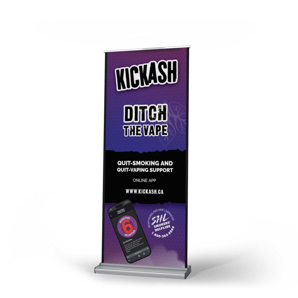
From the start, we designed the quit tool to adapt seamlessly across formats. Whether someone’s accessing it on their phone, seeing a banner at a conference, or sharing a badge on social media, writers and designers worked side by side to make sure every element, from tone of voice to visual style, could translate clearly and consistently in any context.
We built a flexible system that maintains warmth, clarity, and support across platforms, so no matter how someone encounters the tool, it feels like the same encouraging experience.
We’re dedicated to building smart strategic solutions.
Ready to see what we can do for you?