Legal Aid NL
Brand and Launch
The rebranding of Legal Aid NL was about more than modernizing the look. This brand had a big job to do.
Legal Aid lawyers are professionals who are passionate about what they do and they hoped the rebranding would crush stereotypes and help them communicate better with their clients.
Project
The Legal Aid Commission is an important part of the justice system in Newfoundland and Labrador. When they were looking for a new brand and communication approach, WaterWerks was engaged to do the job. The brand needed to be modern and reflective of their professionalism. They also needed a full suite of materials and ideas on how to launch the brand both internally and to the public.
Challenge
Since many of us have our ideas shaped by Hollywood, there were many misconceptions about legal aid support. The public was unclear about how to qualify for help and what kind of legal issues are covered. They were also unaware of the incredibly educated, experienced and fully accredited lawyers working within the Legal Aid Commission team. The focus needed to be about simplifying messaging so people in need could better access the service, and understand they have access to highly experienced litigators.
Solution
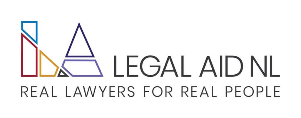
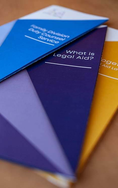
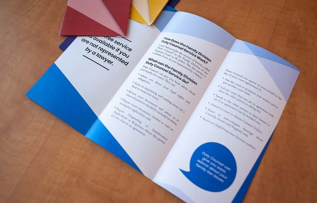
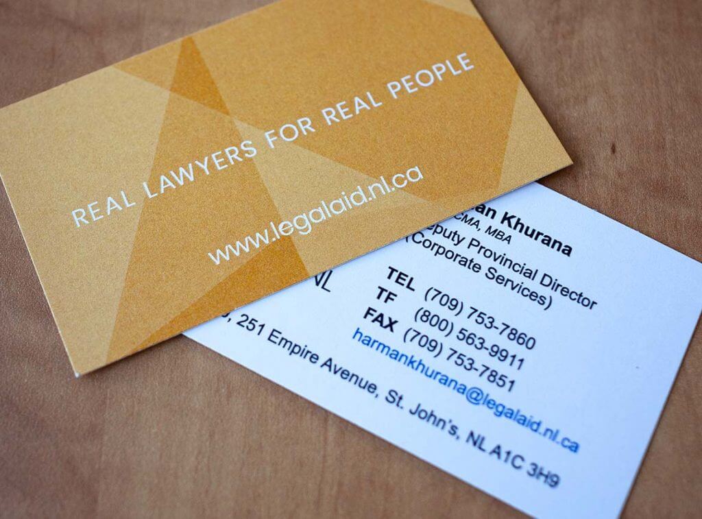
We started with a name change, to the shorter, more memorable Legal Aid NL, then moved on to create the new positioning statement of “Real Lawyers for Real People” to support the new logo. Once that work was complete, our team got to work creating the many elements of the standards guide, to include a stationary package, brochures, signage, banners, and online identity. For launch, we developed press kits, handled media relations, and developed a custom video to unveil the new brand organization-wide.
Logo + Slogan
Legal Aid lawyers are fixers. They find solutions to problems. They solve puzzles. Often, legal aid lawyers are required to help their clients put the pieces of their lives back together. How that puzzle moves and fits looks different for everyone. Finally, how that puzzle looks, in the end, might not be exactly what you expected.
The logo is inspired by a tangram puzzle. The clean lines and shapes embody the professionalism of Legal Aid NL, while the logo’s five main colours represent their five main values: accountability, collaboration, compassion, respect, and openness.
“Real Lawyers for Real People”
It’s a strong slogan that acts as a conversation starter. A thought provoker. This is a statement that speaks to the clients, the lawyers and all the team at Legal Aid NL. The slogan is directly addressing that Legal Aid lawyers are fully accredited and that the clients they serve are human beings with real problems.
The most exciting part of a rebrand is the launch! Finally, unveiling a new brand and fresh materials after months of work.
The client wanted to make sure every member of the organization felt connected to the process and understood the why behind the logo, the slogan, and the materials. So in two days we shot three interviews, b-roll, created animations, and cut together this brand launch story. By separating it into chapters, we were also able to cut it into smaller videos that the client will be able to use on social media and for presentations purposes.
Press Coverage
As part of the launch, WaterWerks developed a press release and handled outreach to the media. The launch was featured in Lawyers Daily and on CBC news.
We’re dedicated to building smart strategic solutions.
Ready to see what we can do for you?