Website + Branding
Provincial Advisory Council on the Status of Women
The interlocking circles represent the important aspects of what The Status of Women’s Council stands for – partnership, unity, protection, endurance, and safety.
The logo design is a modern take on the suffragist’s rosette, which symbolizes the start of advancing the status of women through legislative change.
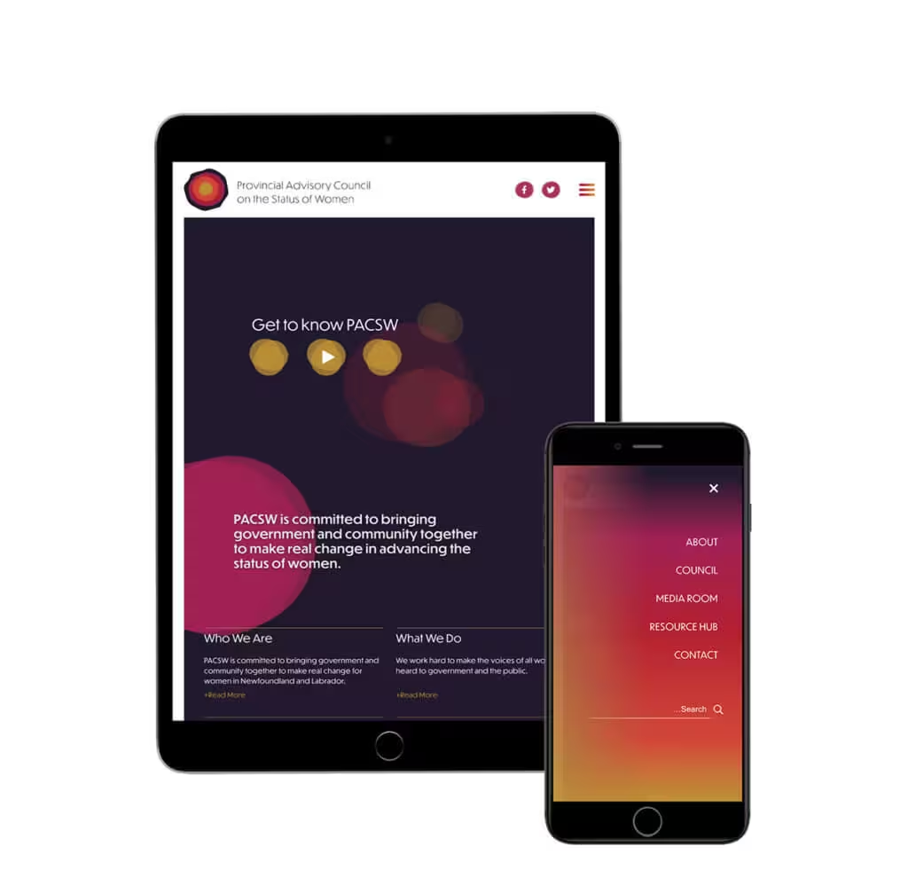
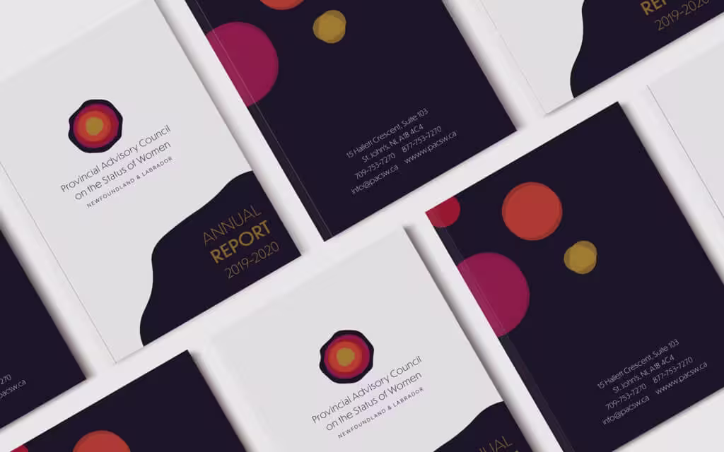
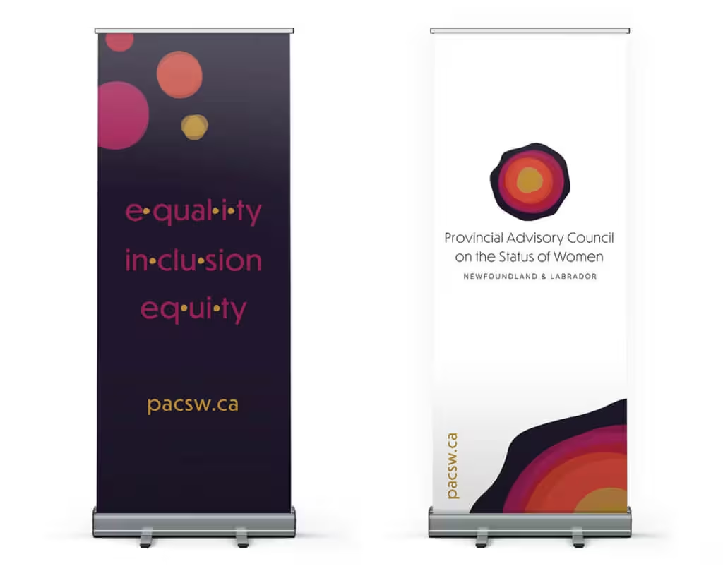
The beauty of the PACSW brand is how each element travels across collateral and carries an entire website.
The nature of PACSW’s work means the website is mainly text-based and doesn’t require imagery. A website without photography can still be visually dynamic when brand elements are used strategically and consistently. The use of the deconstructed rosette, combined with the strong palette, is carried throughout each page on the site.
We’re dedicated to building smart strategic solutions.
Ready to see what we can do for you?